
Visualizing Metrorail from above
I tend to geek out over transit systems, so I frequently find myself on transitmap.net when I have a few extra minutes. Recently, I stumbled across a reader-submitted map where transit lines in New York City were overlayed across an aerial image of downtown. This sent me down an online rabbit hole as I looked at other aerial overlays, including one of my current home, Salt Lake City.
I love this type of visualization. I find it so fascinating how our perceptions of place change depending on how we travel. It’s especially clear at the block level, where a pedestrian experiences the streetscape completely differently than a driver, but I believe it’s just as true when we think regionally. This is obvious when you consider how far you can travel in 15 minutes by foot, bike, bus, or car, but it goes beyond relative distance.
When you walk or bike, you physically experience how individual streets connect to form neighborhoods that connect to form the city. When you take rapid transit underground, it’s like teleporting to a completely different place. And regardless of mode, you find yourself settling into the well-worn grooves of frequently traveled routes.
I doubt most of us think about navigation from a spatially accurate perspective either. We each have our own mental map of our surroundings, which is influenced by where and how we travel, the built environment, and how directionally gifted or challenged we are. I could probably draw a highly detailed map of northwest Washington, DC from memory while someone else might only know how to get downtown by taking the Red Line.
Growing up, I would get to downtown Springfield by driving south from my house, but I was always traveling “up” – or “north” – in my head. Similarly, my perception of what direction was “up” in DC depended on where I was traveling. (Like in Ender’s Game, the enemy’s gate is down.) But even though that’s how I perceive it, seeing downtown DC rotated 180 degree is still a little uncanny.
Going back to the aerial overlays, a schematic transit diagram offers a simplified interpretation of the real world. It helps you navigate the transit system and usually includes some contextual details like rivers, green space, or local boundaries, but it ignores almost everything outside of the system itself.
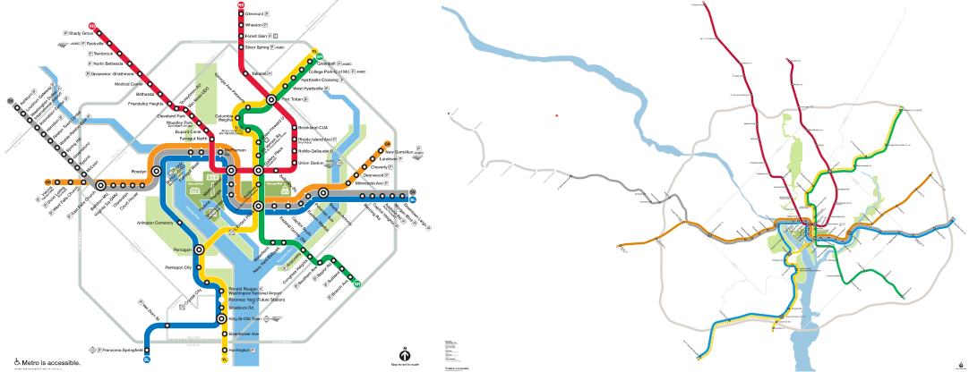
If you ride the system enough, you start to think more about the city from the perspective of the schematic and less about the city’s form itself. Looking at a spatially accurate depiction of the system challenges this perception – especially when it’s a novel view of the city, such as an aerial overlay.
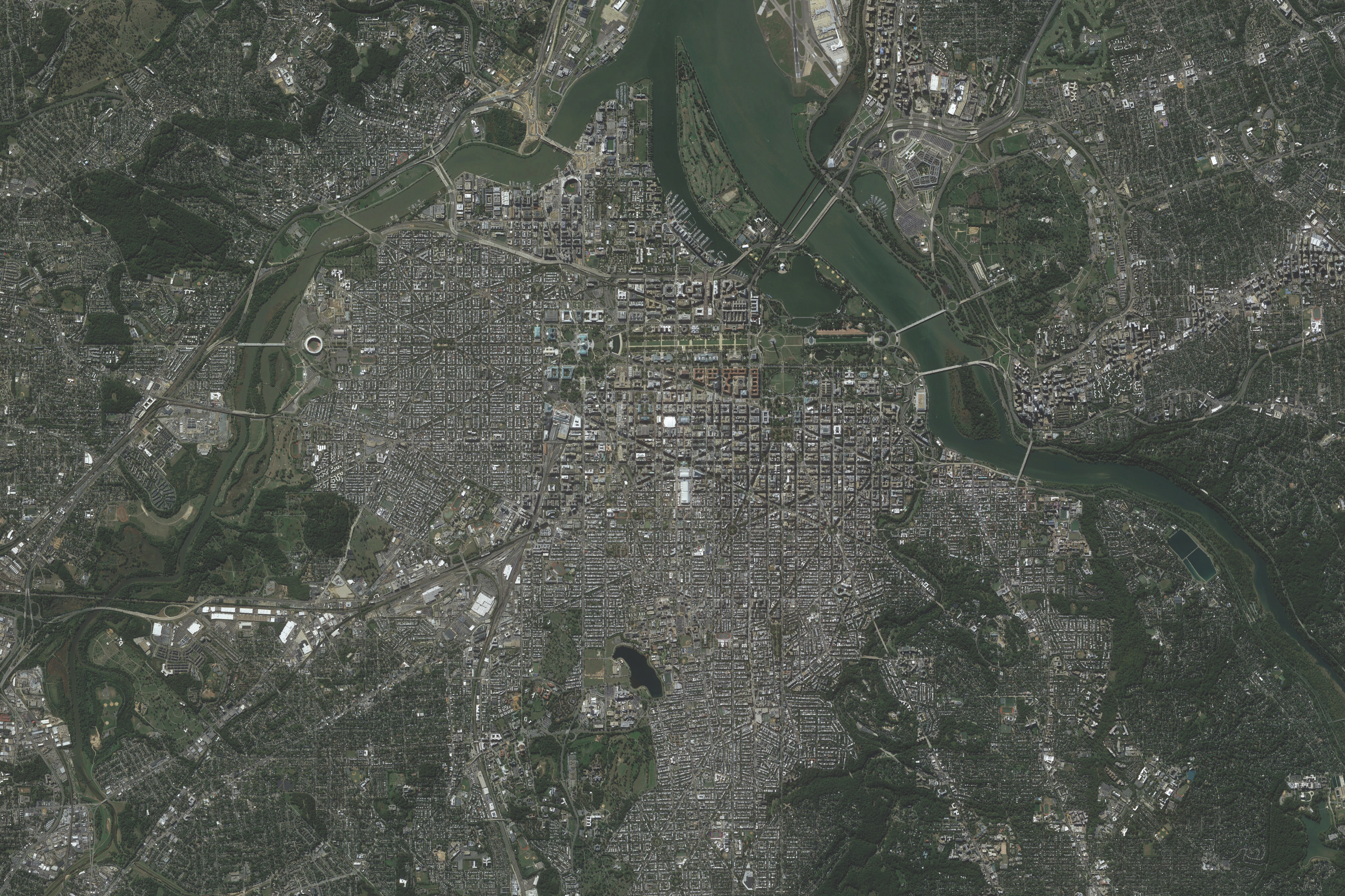
I wanted to see what this looked like for Washington, DC, so I decided to make my own maps. It’s surprisingly hard to find good aerial imagery, because it needs enough range to be meaningful and enough detail to be recognizable. Once I found two images that I liked, I opened Adobe Illustrator and started drawing.
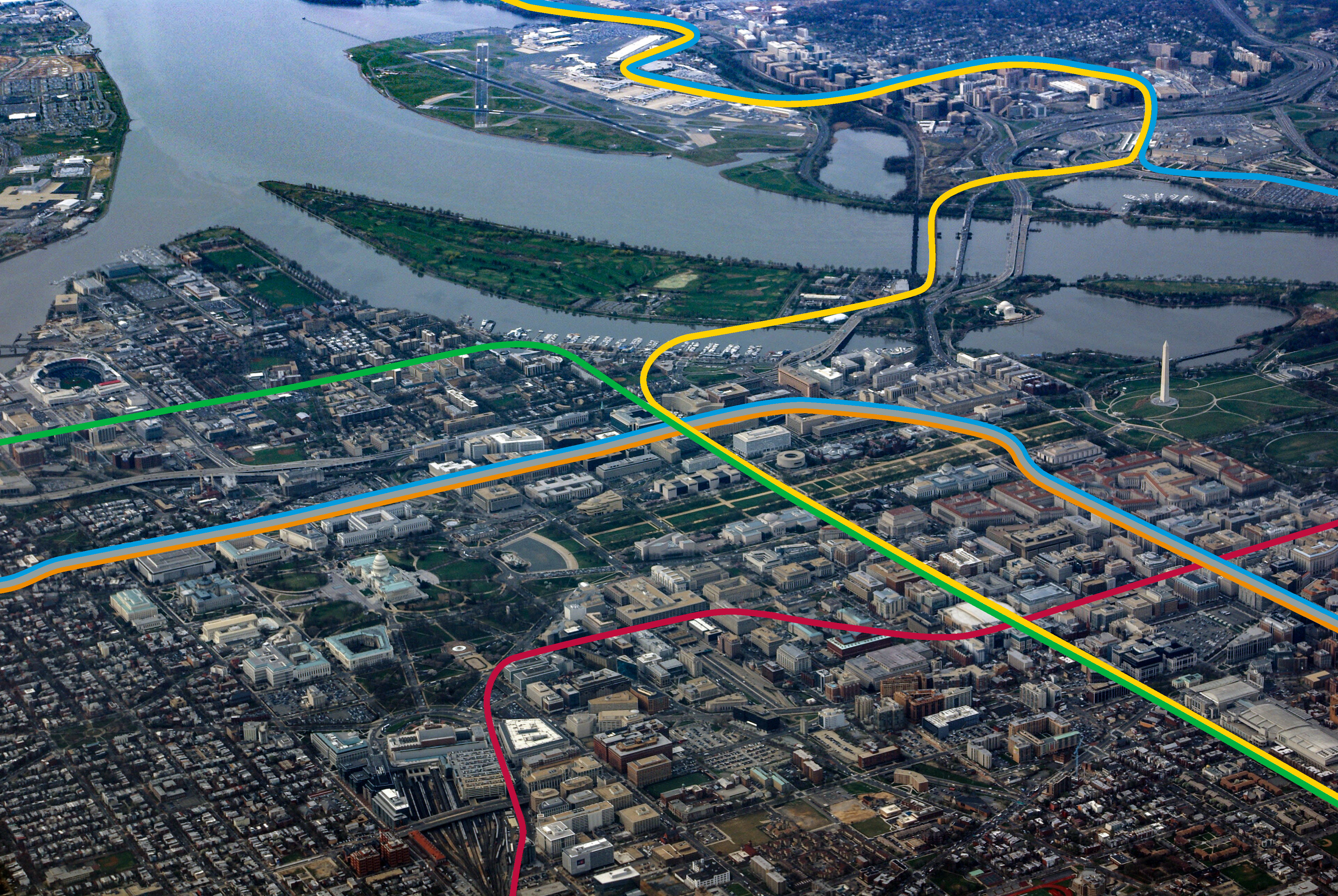
This was the first time that I’ve used Illustrator for creative work, and it took a little while to get used to the Curvature tool. I’m probably still missing some aspects of how it’s supposed to be used, but I realized it was easiest to draw a rough line and then modify the points directly. I used the Offset tool for the sections with parallel lines (and the next step is learning how to use an Art Brush to stylize a single line as parallel lines). Finally, I used WMATA’s style guide for the rail line colors.
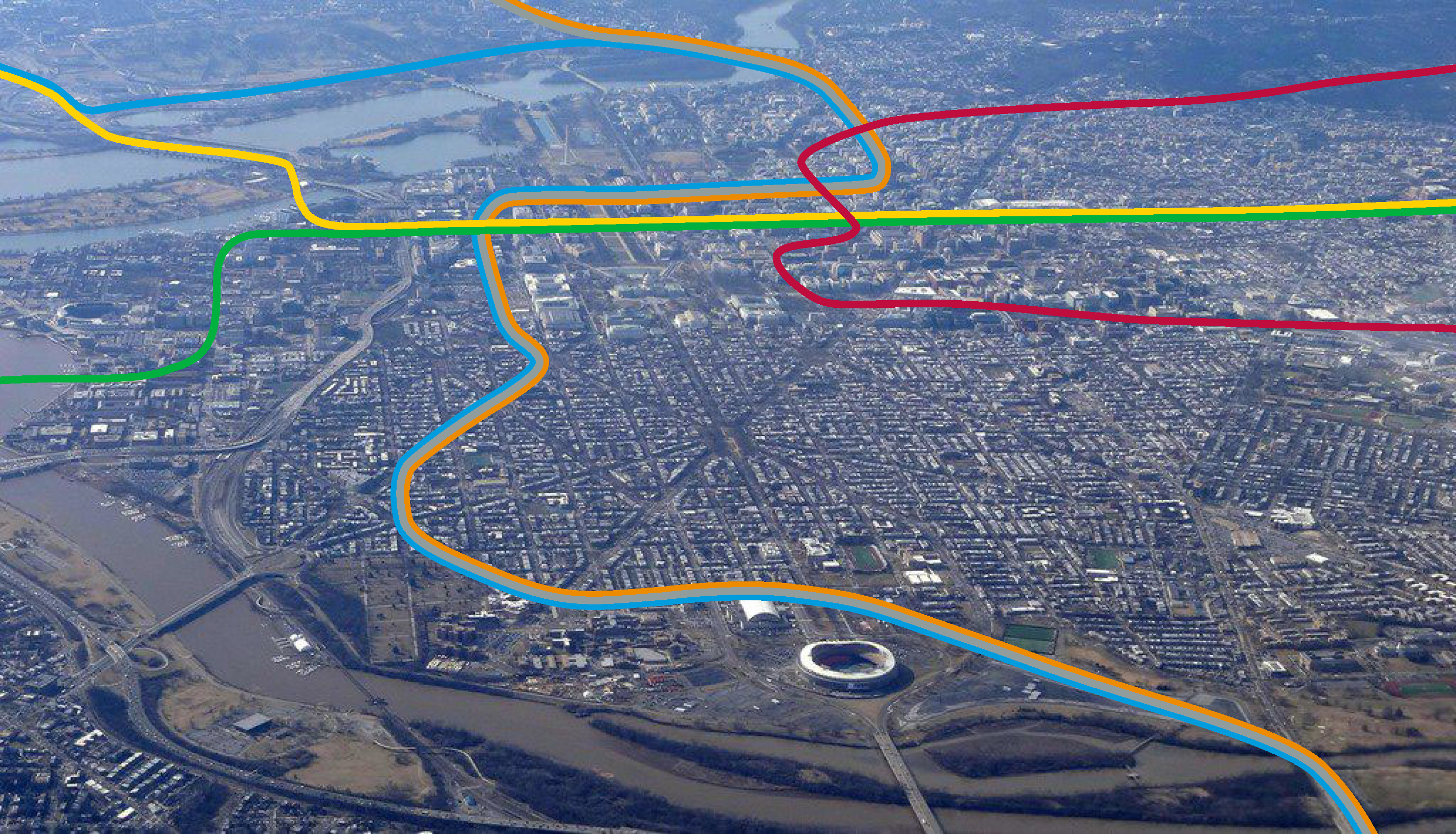
Note: The base images were sourced from Matti Blume (via Wikipedia) and Daniel Slim AFP/Getty Images (via The Dallas Morning News) and the spatially accurate Metrorail map was created by Peter Dovak.
.jpg)