Visualizing where I've run
A few months ago, I stumbled across a tutorial by Andriy Yaremenko on animating Strava .gpx tracks in QGIS and had one of those moments where you can practically see the neurons firing as a lightbulb goes off in your head.
Some context:
Only a few people know this, but I’ve mapped basically every road or trail that I’ve ever run on. It started in early 2017 as a way to procrastinate on midterms and I quickly became obsessed with running new places so that I could increase the coverage. The process itself was very basic – I didn’t have any GIS experience at the time, so every segment was hand-drawn in Google Earth. I actually still do it manually and probably won’t stop, because it looks cleaner and I don’t need to worry about poor or missing GPS data.
I still have an early screenshot of what Washington, DC looked like after I started; I had only been living there for a few months, but I already knew most of the main routes near campus.
Maintaining the map has shaped how I think about and see the world – and it wouldn’t be a stretch to say that it kickstarted my passion for planning, transportation, and mapping. Plus, it’s so fun to see how the map has grown.
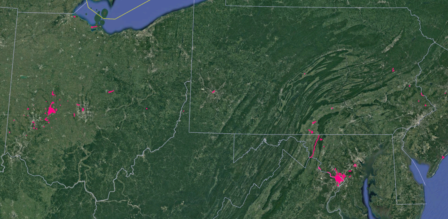
And it’s not just DC, but everywhere that I’ve ever run – from my hometown (on the left) to random xc courses in southwest Ohio to a very long trail run in northern Maryland.
However, one downside of this approach is that it sacrifices magnitude for extent. An alternative visualization would be a heatmap, such as Strava’s global heatmap. Interestingly enough, I can literally see my running habits on the global heatmap because relatively few people use Strava in my hometown. I could create my own personal heatmap, but Strava does this for me through my student subscription.
The other downside is that both approaches are relatively static. While both maps can show changes over time, the change is slow and neither map captures the movement itself.
The process:
I wouldn’t have been able to do this without Andriy’s tutorial, which was very helpful and straightforward. The specific steps can be found there, but I’ll share a few comments on my own workflow.
GPX: Strava will only bulk export .fit files, so I had to manually download each .gpx file. This was tedious but ultimately preferable to a bulk export, since I could more easily isolate the runs that met the criteria for each map. The Batch GPS Importer plugin is fantastic and I’m already using it for other projects.
Animation Rate: I used a 20-second interval to generate the stills, which ended up being a good rate since it was slow enough to follow the smaller details but fast enough that each GIF was only 20-30 seconds long. The exception was my run across Maryland; I used a 120-second interval since the activity time was about six times as long.
Stopwatch: I decided not to add a stopwatch because I didn’t think that seeing the time pass added much to the visualization, with the exception of the Maryland run since it was so long. I did find that adding -240 and -120 (or -40 and -20) to the Atlas coverage layer to create a blank map resulted in the stopwatch reading 23:56 and 23:58, so instead I duplicated the 0 layer when creating the final GIF.
Creating GIFs: I tried to use GIMP to create the GIFs, but it seemed to struggle with the size so I used Photoshop instead, which proved to be much easier. Each animation took about 90 minutes to create, but most of this time was spent waiting for Atlas to generate each image (200-350 depending on the animation) and for Photoshop to generate the GIFs. Also, Instagram doesn’t support GIFs so I had to convert them to MP4s.
The result:
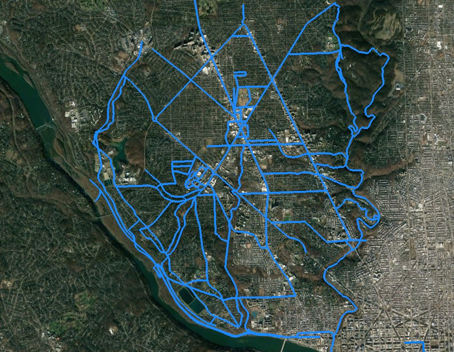
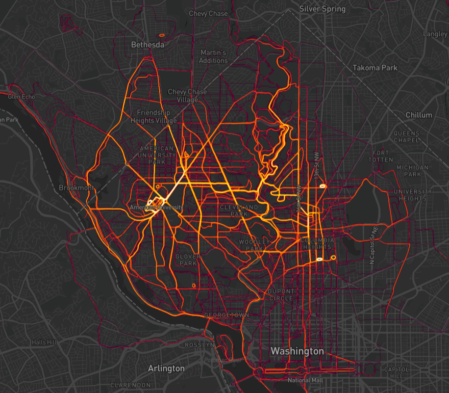
The first animation captures every single run I completed from Tilden House (the best group house in DC) with my roommate Andrew. We shared many dark, cold, early morning runs together and our friendship – and the house – were a defining part of my life in DC. I decided to keep this visualization simple since the lines do such a great job of defining northwest DC – especially Connecticut Avenue running diagonally across and Beach Drive curving up through the center.

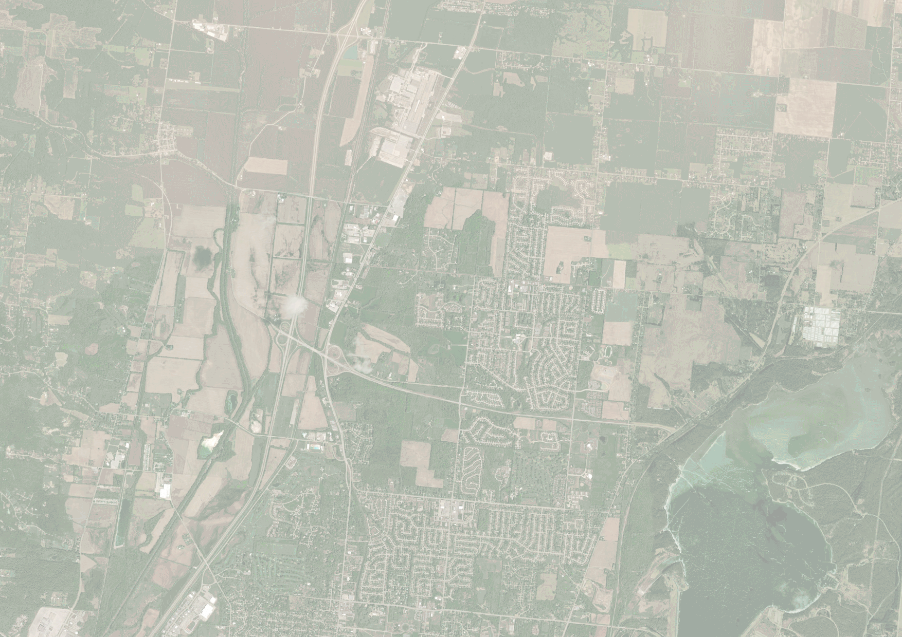
The next animation shows most runs from my parents’ house since 2020. I added the satellite imagery to show how my runs at home depend on the surrounding land use – either suburban development or country roads. I like this map because it captures some of my habits. I almost always run certain loops or roads in a specific direction, even though the specific route may vary.
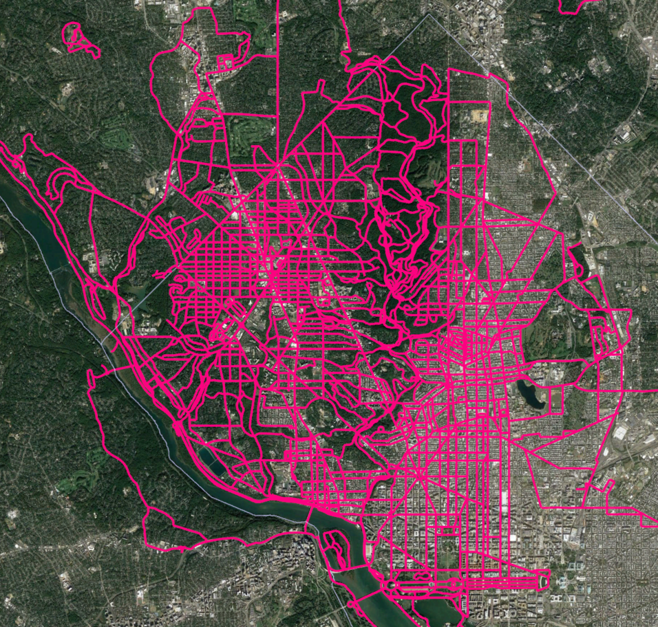
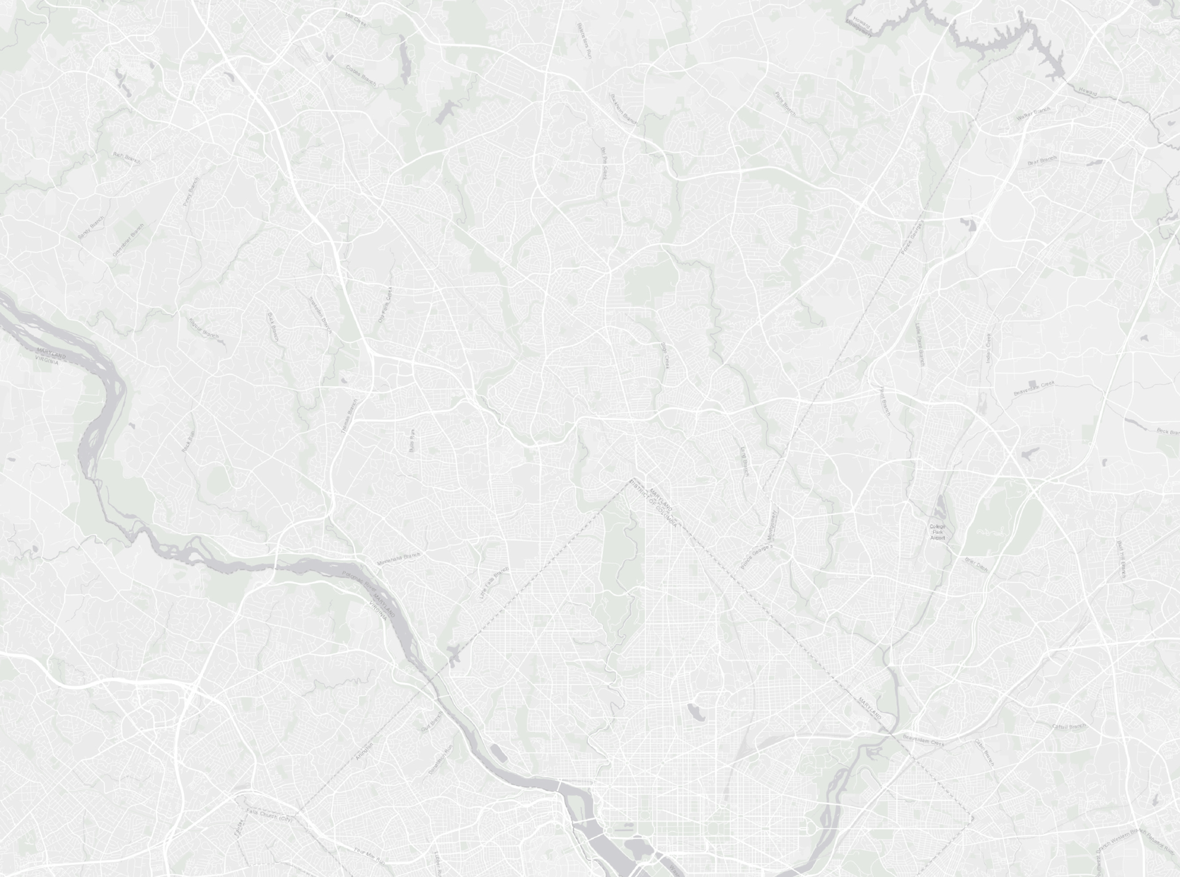
The next animation shows how my roommate Tim and I explored DC’s regional trail network at the start of the pandemic. We were both working from home in a small two-bedroom apartment and needed fresh air and something to look forward to each week. In fact, the Google Earth map shown earlier helped us track where we’d been and where we should go next. I decided to add a light base map to provide some context for those who might not be as familiar with the region.
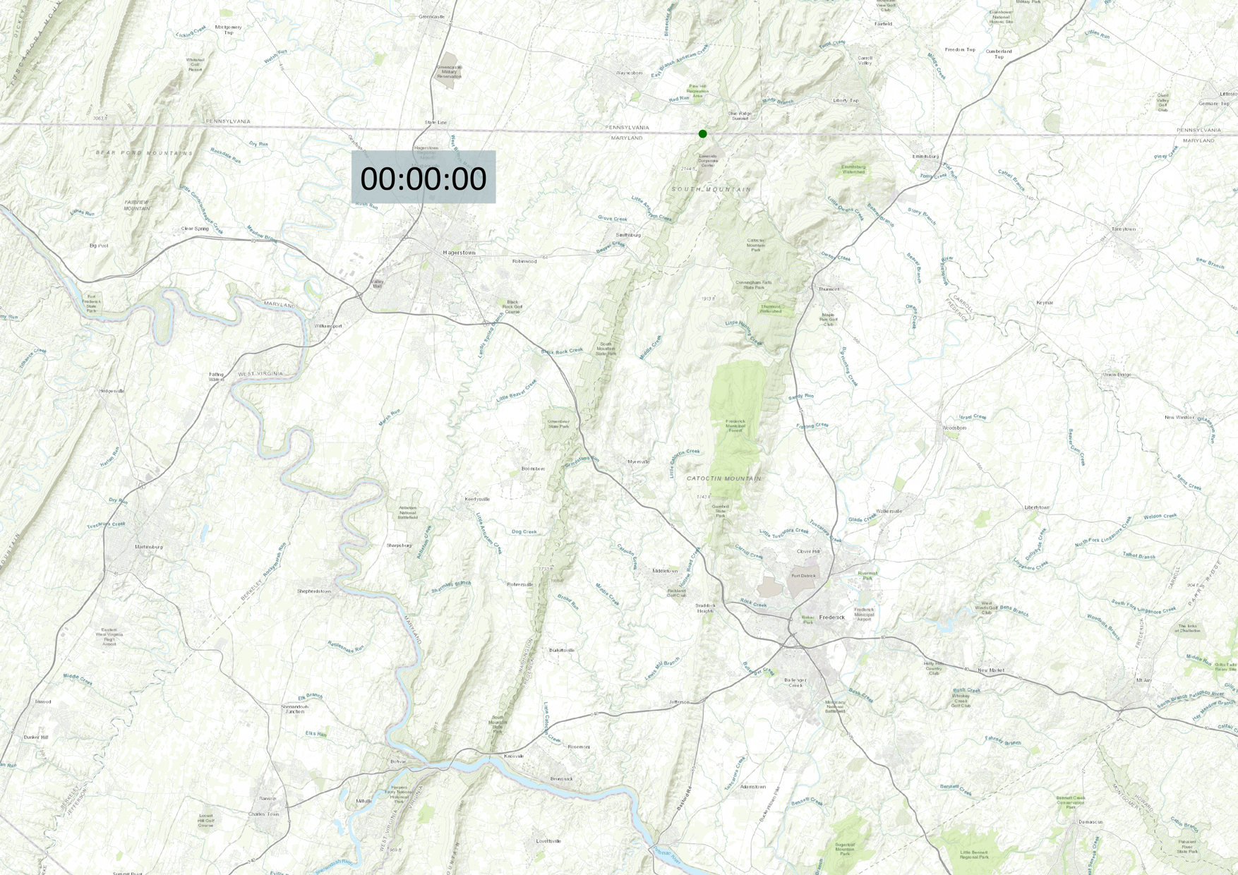
The last animation depicts my longest run (so far) – a 40-mile odyssey along the Maryland section of the Appalachian Trail. Easily one of the hardest, most rewarding experiences that I’ve ever had. This animation isn’t as interesting as the others, but the story behind it adds personal meaning.